Case Study
Online
Bhangarwala
Designing a city-scale scrap pickup system for real-world users
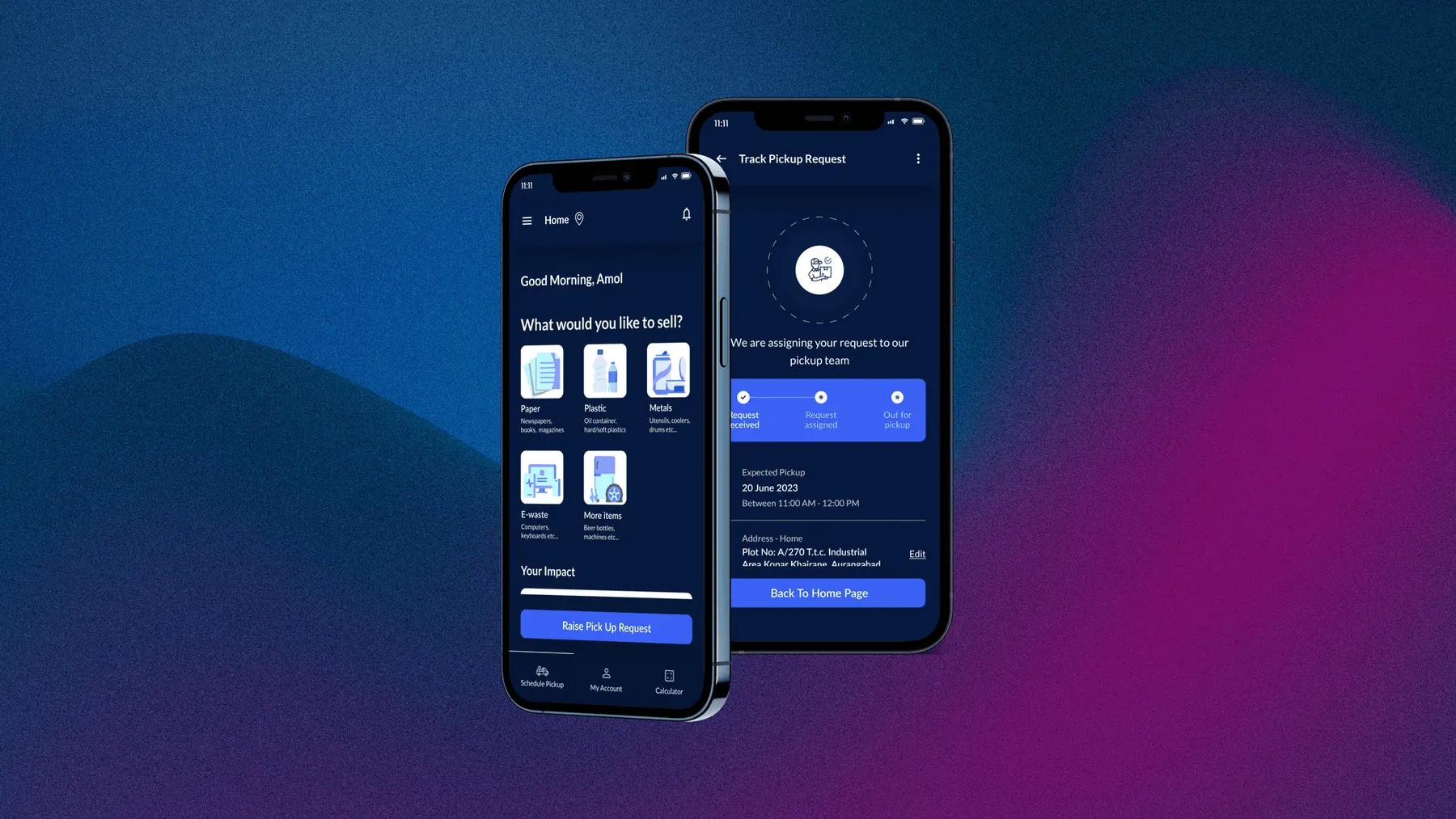
The Villain.
Entropy & Information Chaos
Some projects land in your lap with dashboards and design systems. This wasn't one of them.
Online Bhangarwala started as a simple question from the client: "Can we build something that lets users schedule scrap pickups, and agents can manage collections - like Swiggy, but for kabadi?"
The real villain wasn't a person; it was the process. Agents relied on paper scraps and memory. Customers relied on shouting from balconies. This chaos led to:
- Missed pickups and revenue loss.
- Zero data visibility for business owners.
- High cognitive load for low-literacy agents.
Discovery.
Mapping the Chaos
We didn't just guess. Stakeholder interviews revealed that while customers wanted a sleek "Silicon Valley" app, agents often struggled with complex text. We audited competitors like Scrap Uncle and Kabadiwala to find the gaps in onboarding and trust.
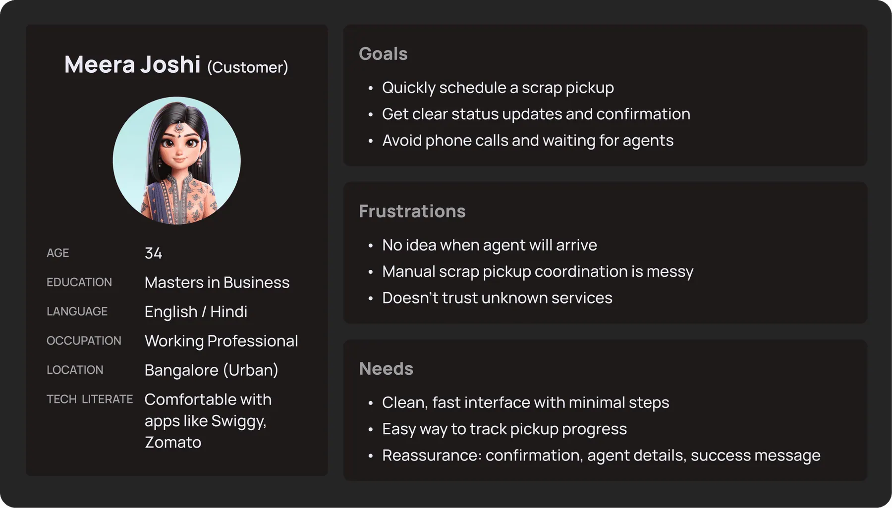
The Customer
"I want to clear my trash, get paid, and not wait around all day."
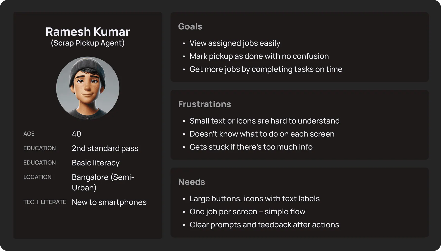
The Agent
"I need to know where to go next without reading complex text."
The Blueprint.
Clarity > Decorations
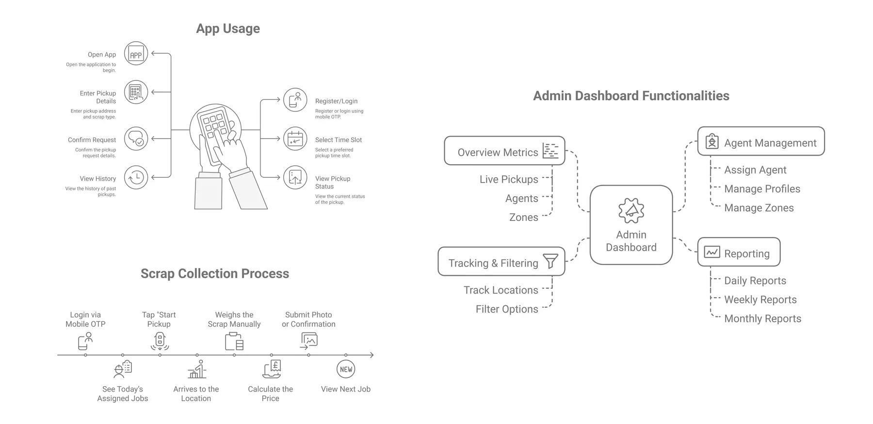
We mapped user flows for three distinct personas. The focus was on stripping away non-essential elements to ensure usability for agents who might be new to smartphones.
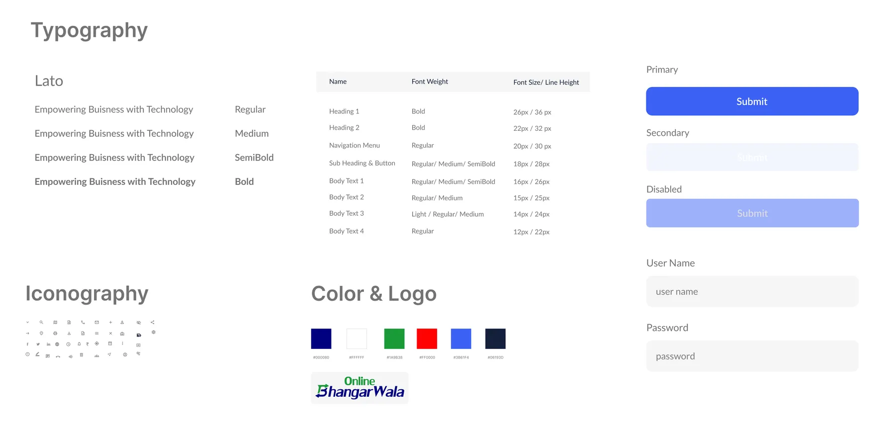
Modular Design System
Created a scalable component library with predefined spacing, typography, and color tokens to ensure consistency across Customer App, Agent App, and Admin Panel.
Linear User Flows
Agent workflows were designed as a single, linear path. No branching logic. Step 1 must be completed before seeing Step 2. This prevents errors in the field.
Role-Based Access
Admins see high-level data. Agents see only their immediate tasks. Customers see only their pickup status. Information is disclosed progressively.
The Execution.
Solving for the "Two Worlds"
The core challenge was designing for two extremes: The tech-savvy customer expecting a Swiggy-like experience, and the field agent who needs large, foolproof buttons.
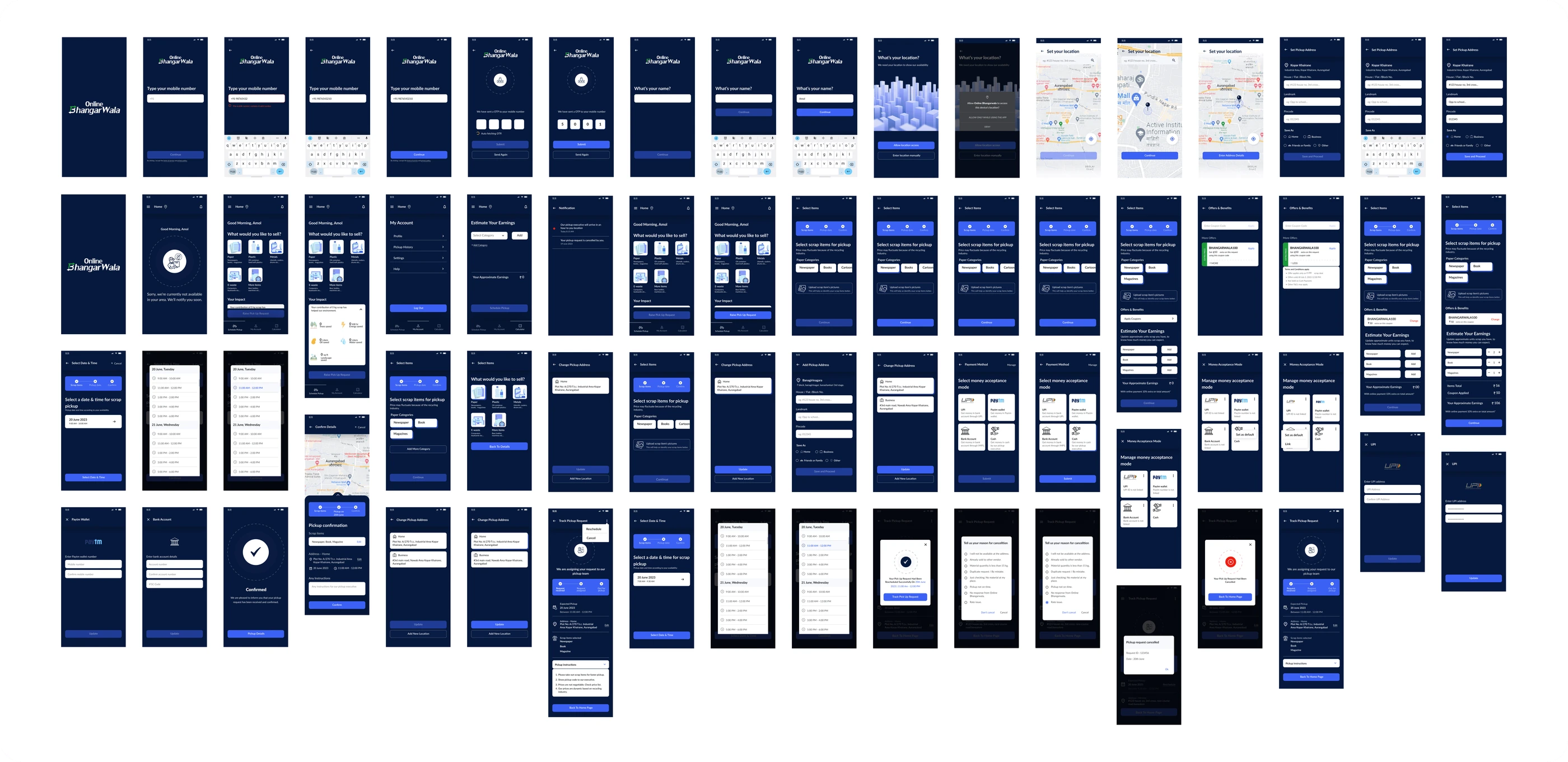
Customer App
Focus on transparency, trust, and speed of booking.
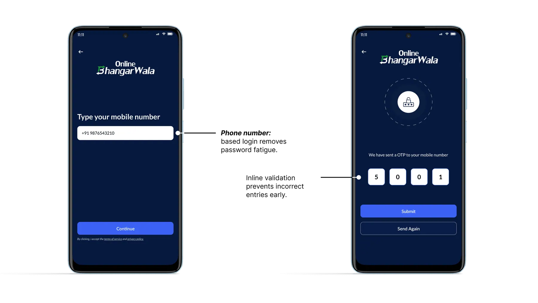
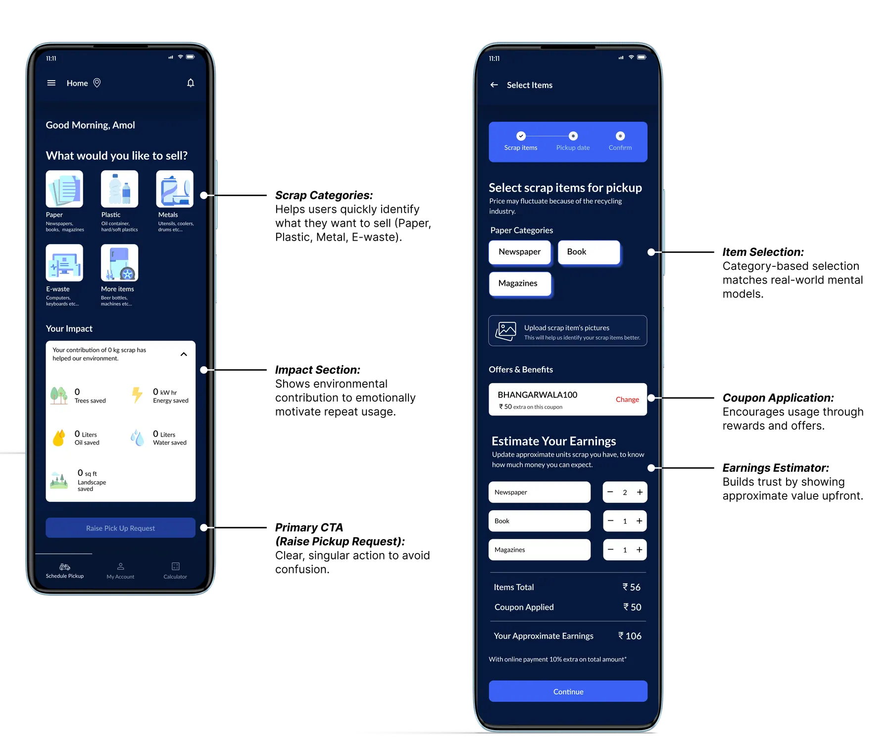
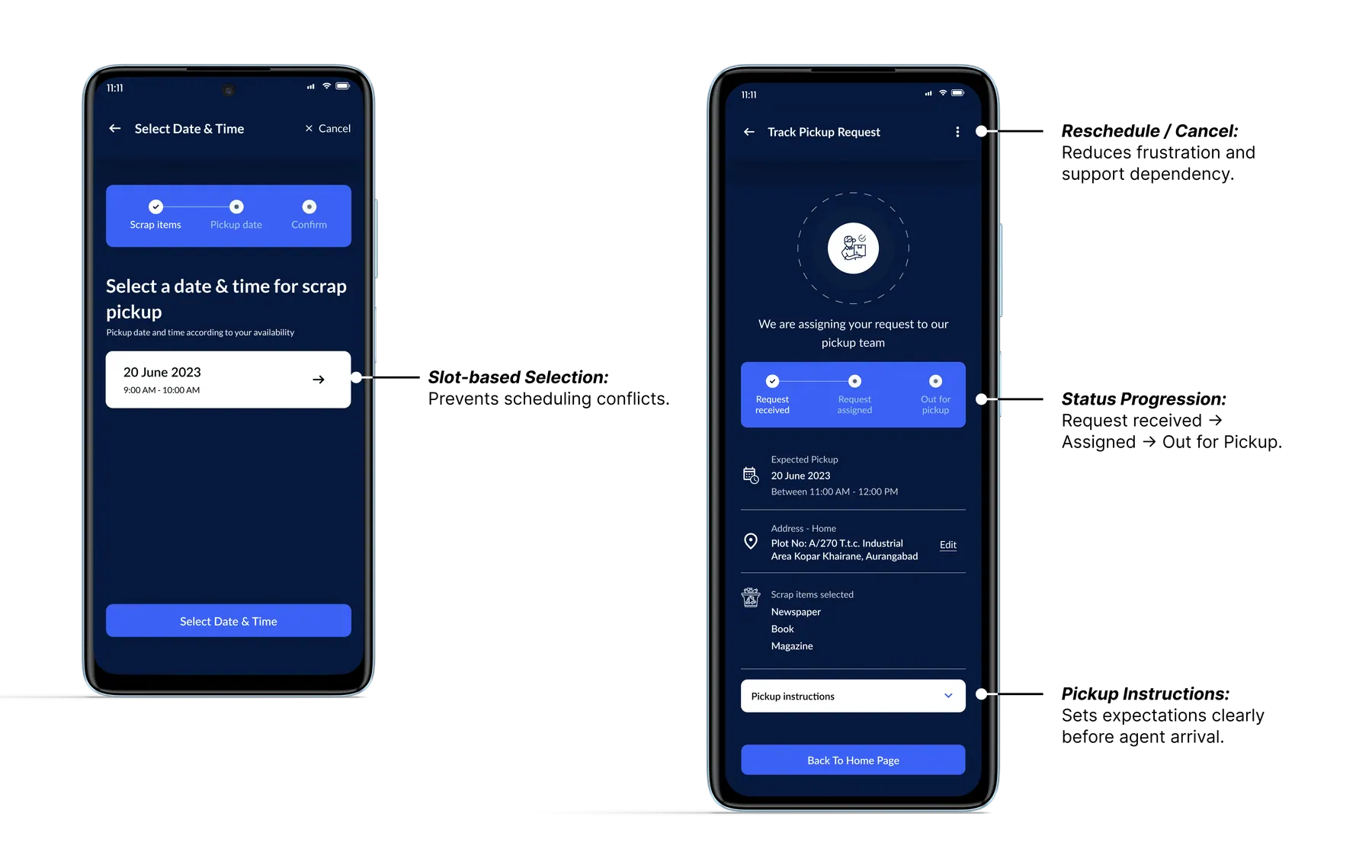
Complete Customer App Experience
An overview of all customer app screens designed as a cohesive system, balancing ease of use, transparency, and real-world constraints while guiding users smoothly from intent to pickup completion.
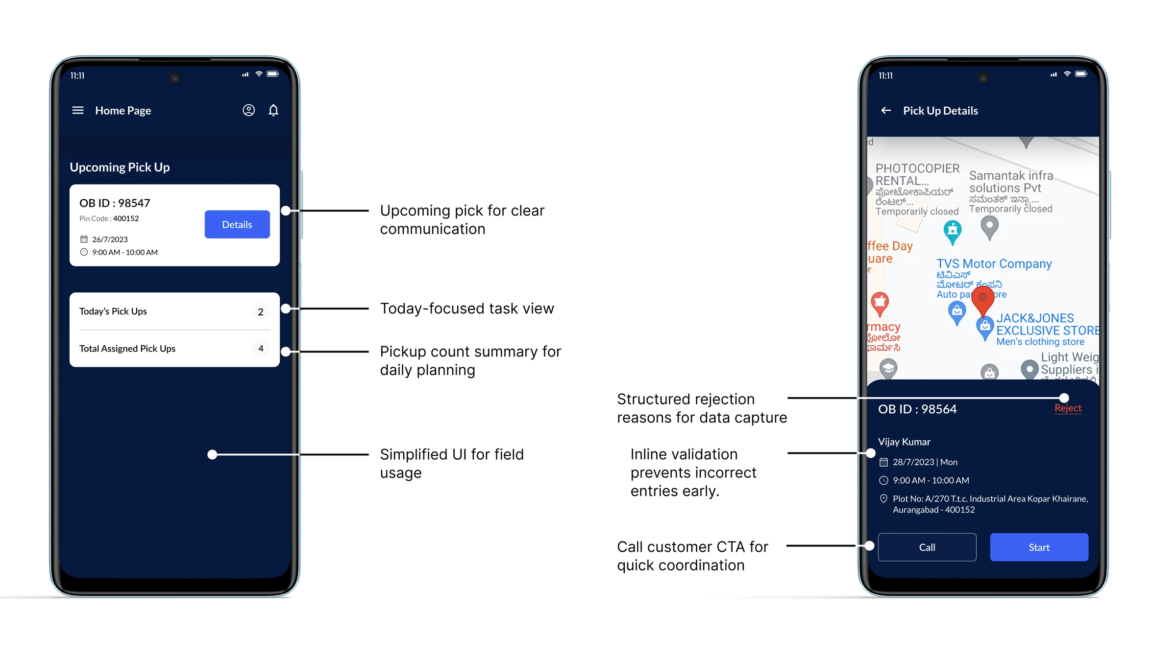
Agent App
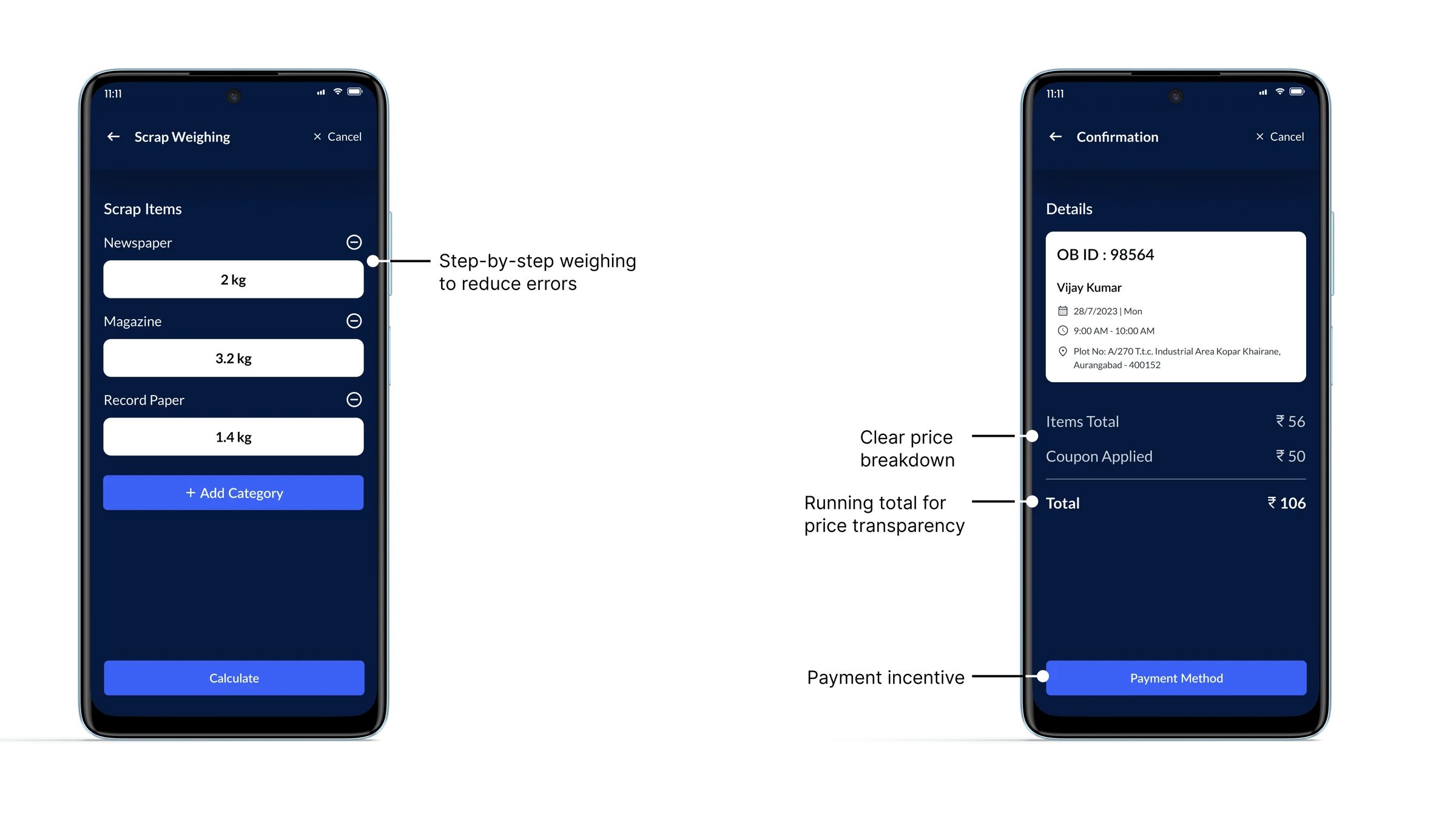
Optimized for outdoor usage, one-handed operation, and low digital literacy.
Agent App - End-to-End Screen Coverage
This section presents the complete set of agent-facing screens designed for Online Bhangarwala, supporting efficient pickup execution from assignment to completion.
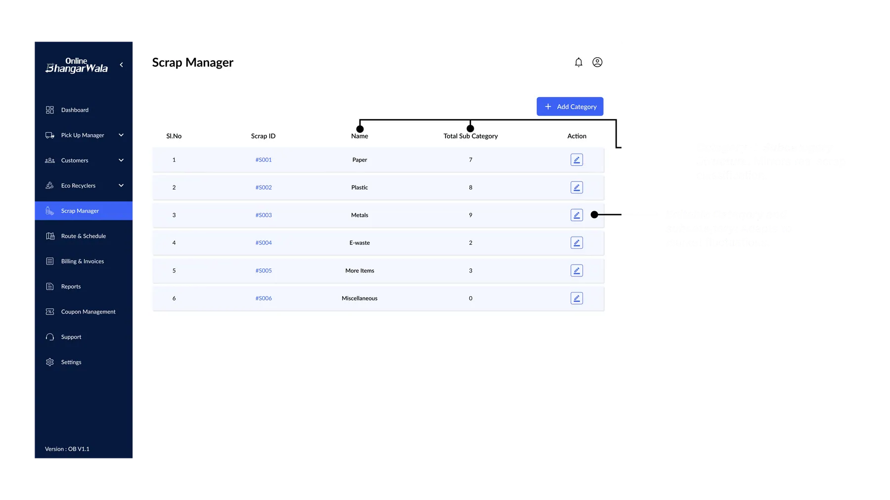
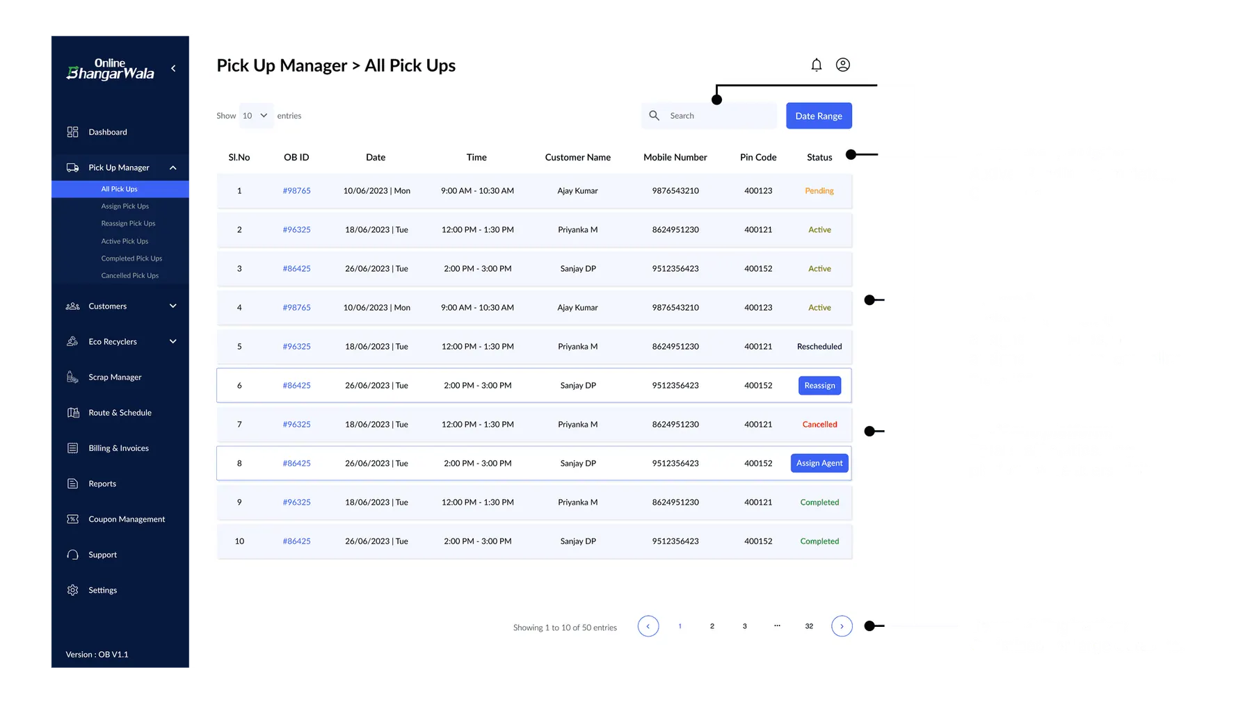
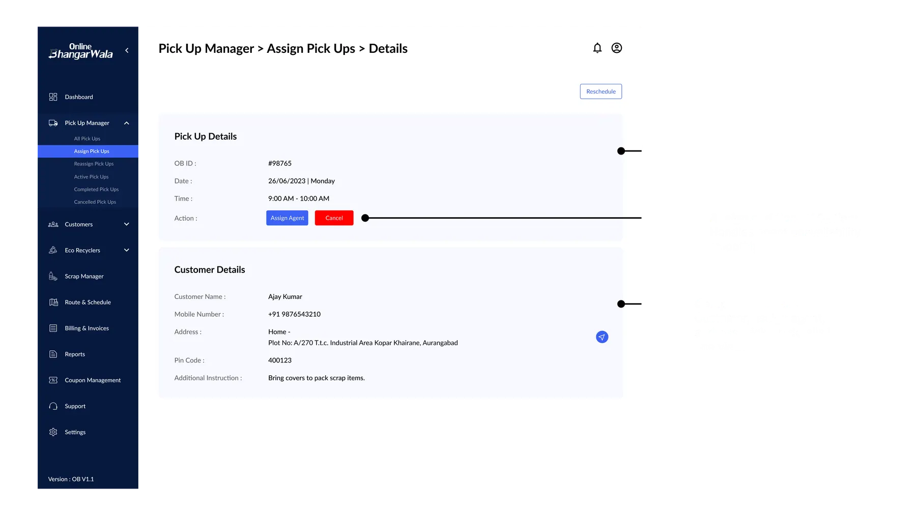
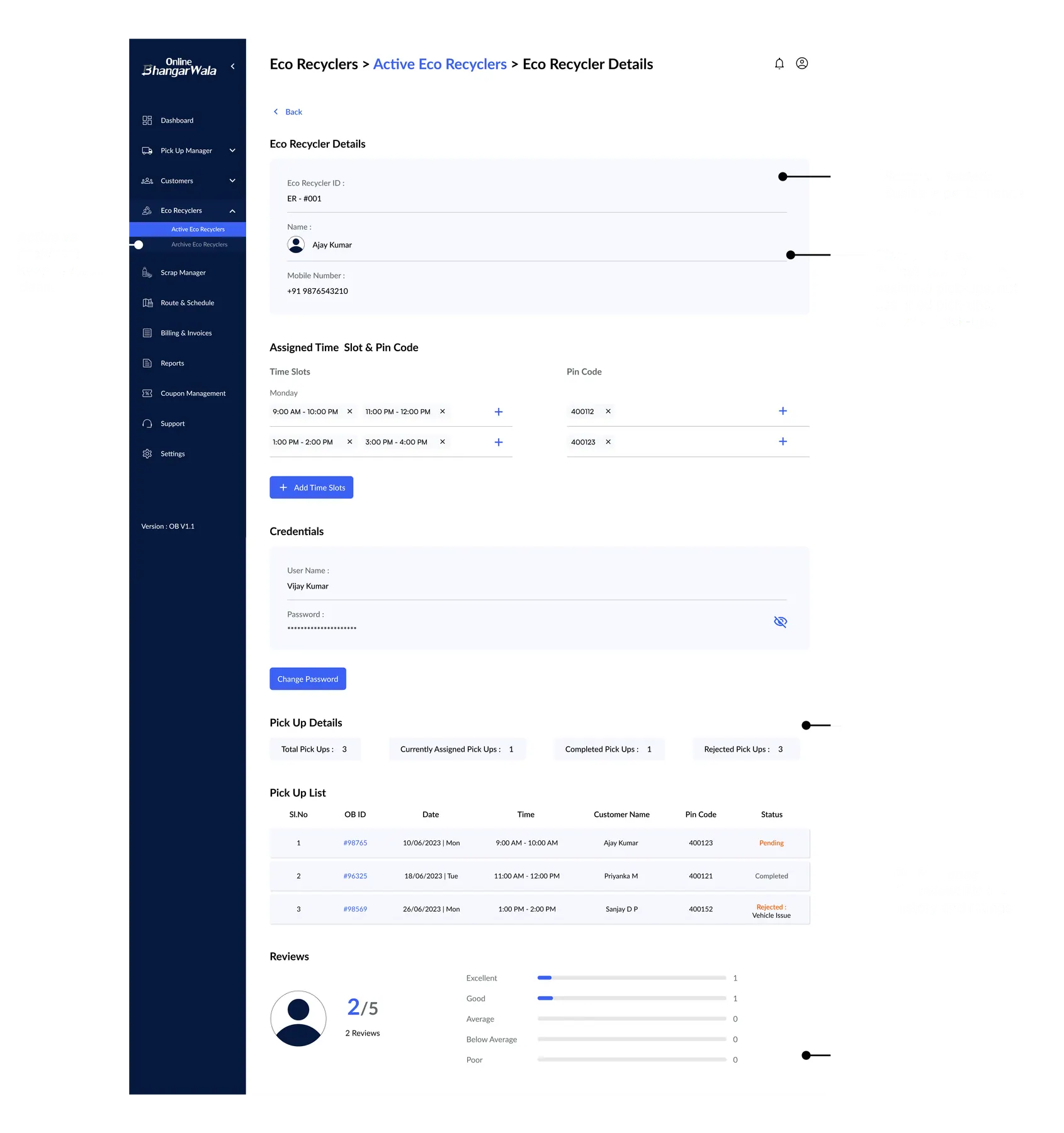
Admin Command Center
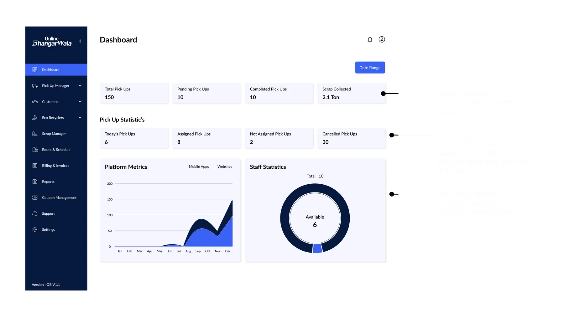
A modular dashboard allowing business owners to assign agents, manage zones, and view daily performance at a glance.
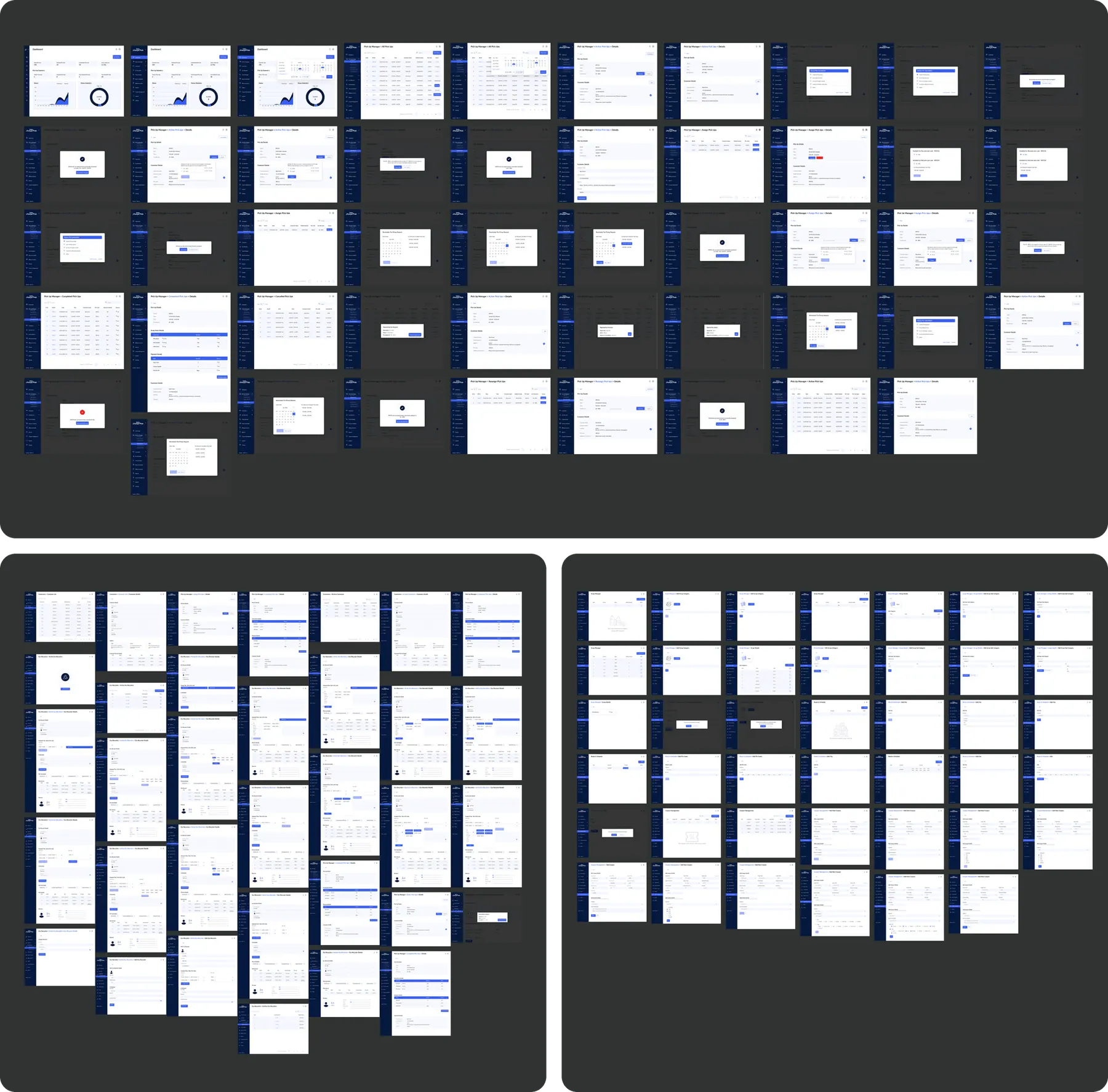
Admin Portal - End-to-End Screen Coverage
This section presents the complete set of admin portal screens designed for Online Bhangarwala, enabling centralized control over operations, agents, pricing, and reporting.
The Outcome.
Impact & Retrospective
We mapped user flows for three distinct personas. The focus was on stripping away non-essential elements to ensure usability for agents who might be new to smartphones.
New agents could start working effectively in under 10 minutes due to easy status system and linear flows.
Simplifying the customer booking form led to a significant decrease in abandonment rates during the pickup request process.
What I Learned
- Designing for low-literacy users means eliminating friction completely. Icons > Text.
- A consistent design system saves massive time for both designers and developers.
- Collaborating early with developers prevents miscommunication and rework later in the cycle.
Let's Craft Quietly
Have a project in mind?
Let's bring it to life gently.